 Case study · Ecommerce · Brand & Shopify
A gold-struck new identity. An art direction built from hand-cut paper dioramas. And a ground-up Shopify rebuild to carry them both. This is how Masters of Mystery went from selling game kits to staging them.
Visit mastersofmystery.com ↗The brand
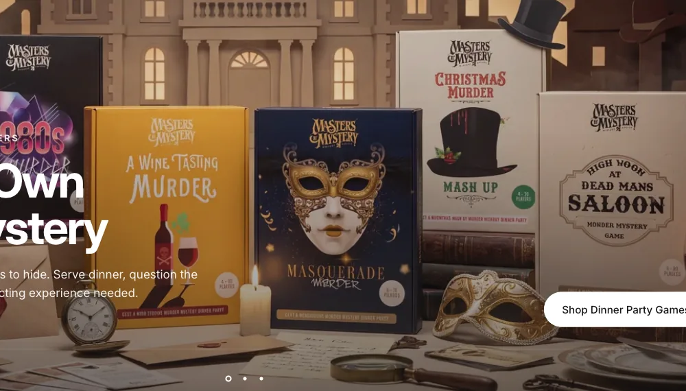
Masters of Mystery is one of the biggest names in murder mystery games — dinner-party kits, cold case files and escape rooms played by hosts across the UK, US and Europe, rated 4.7 from more than 11,000 reviews. The games were loved. The brand around them had been outgrown. RiseUp was asked to rebuild everything a customer sees: the mark, the product art, and the store itself.
The challenge
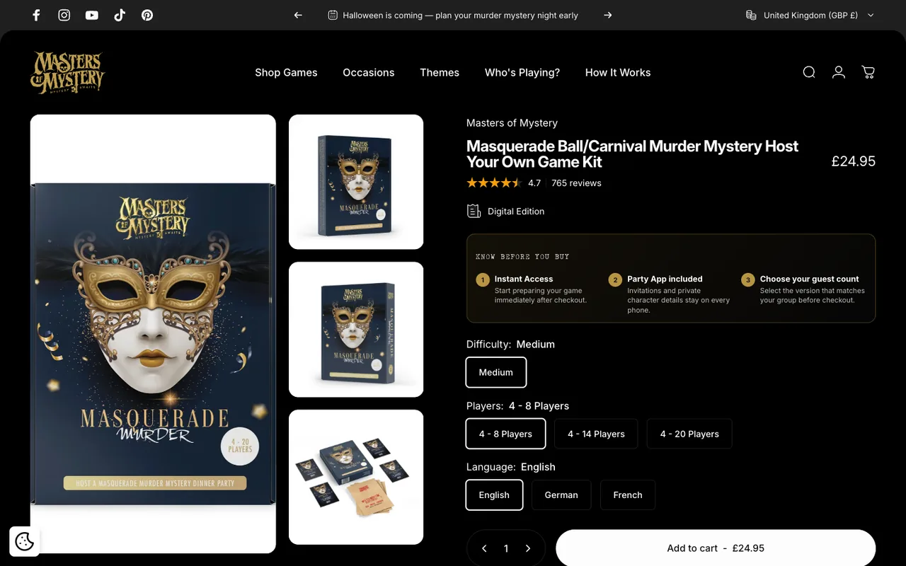
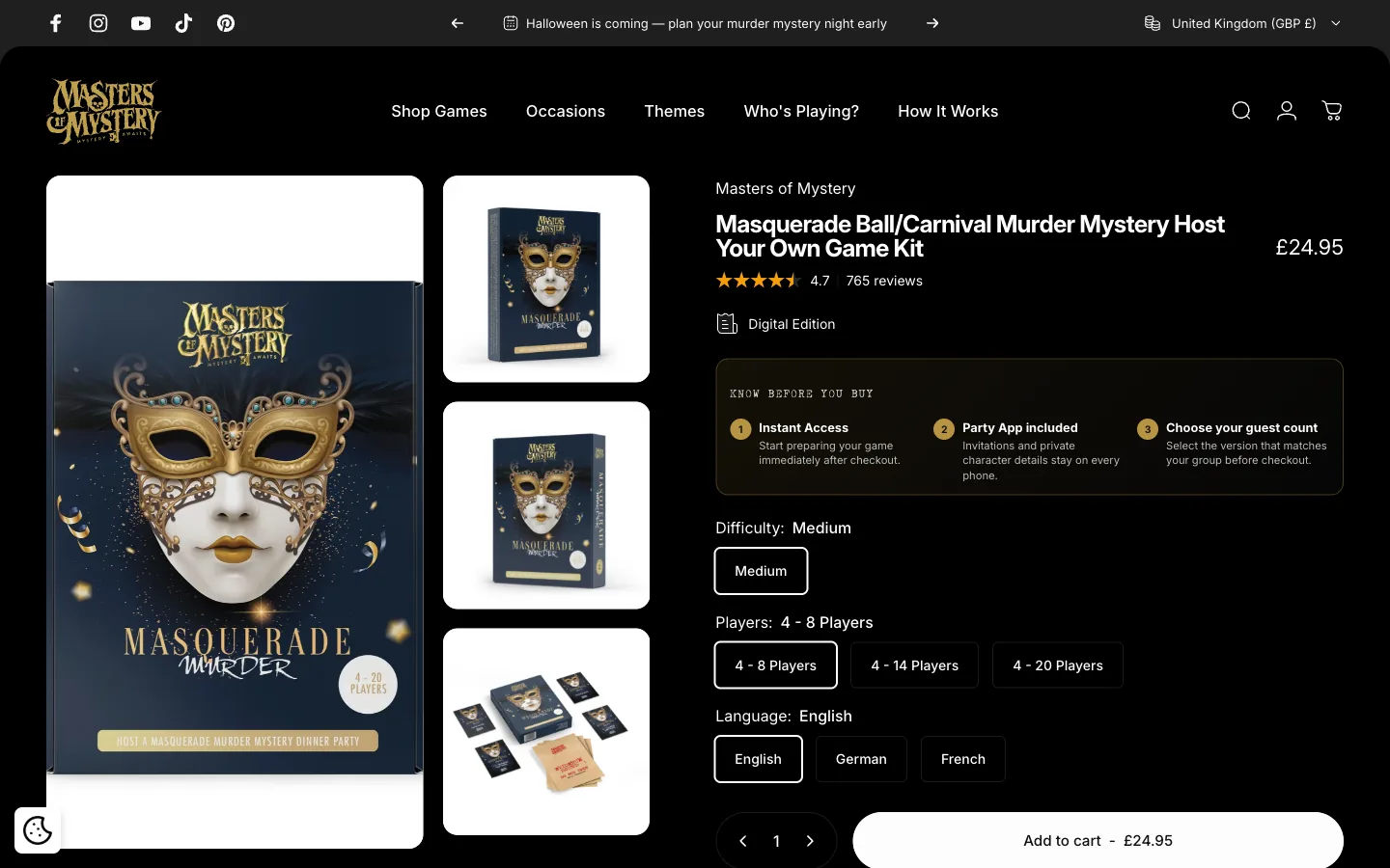
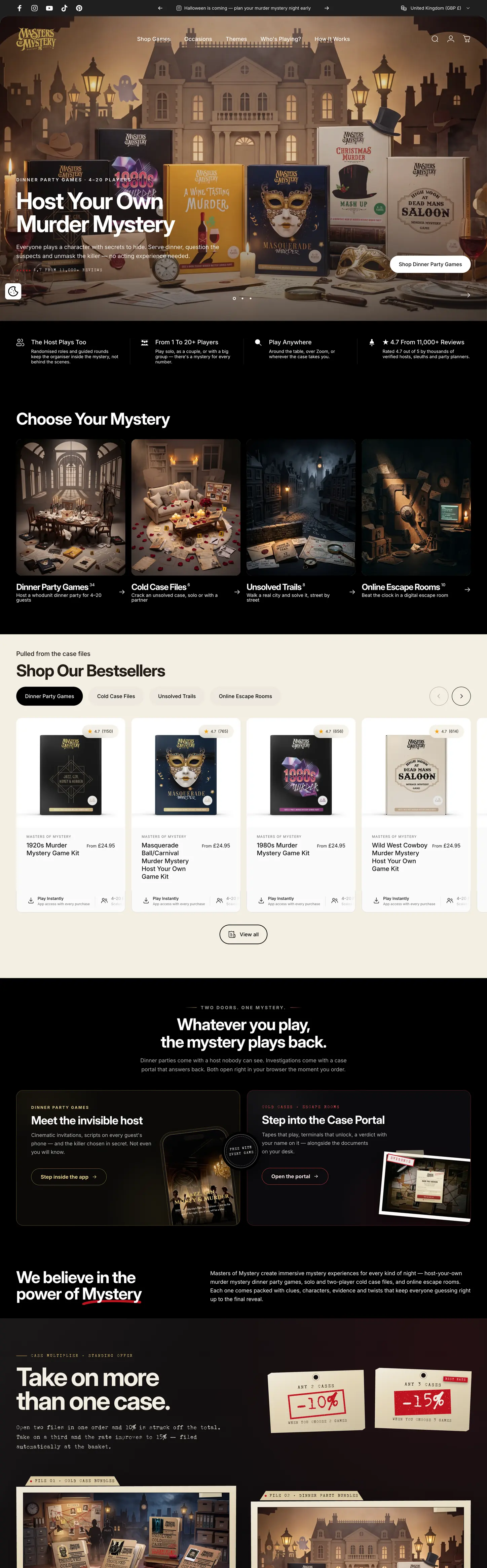
Most of the catalogue lives in the companion app and case portal. On the old store, premium games read like flat listings: stock photography, a stretched template theme, product pages that told you nothing about the night you were buying. The brief was to give every game the shelf presence of a boxed board game, then build a storefront fast enough and clear enough to sell it — without losing the search equity the brand had spent years earning.
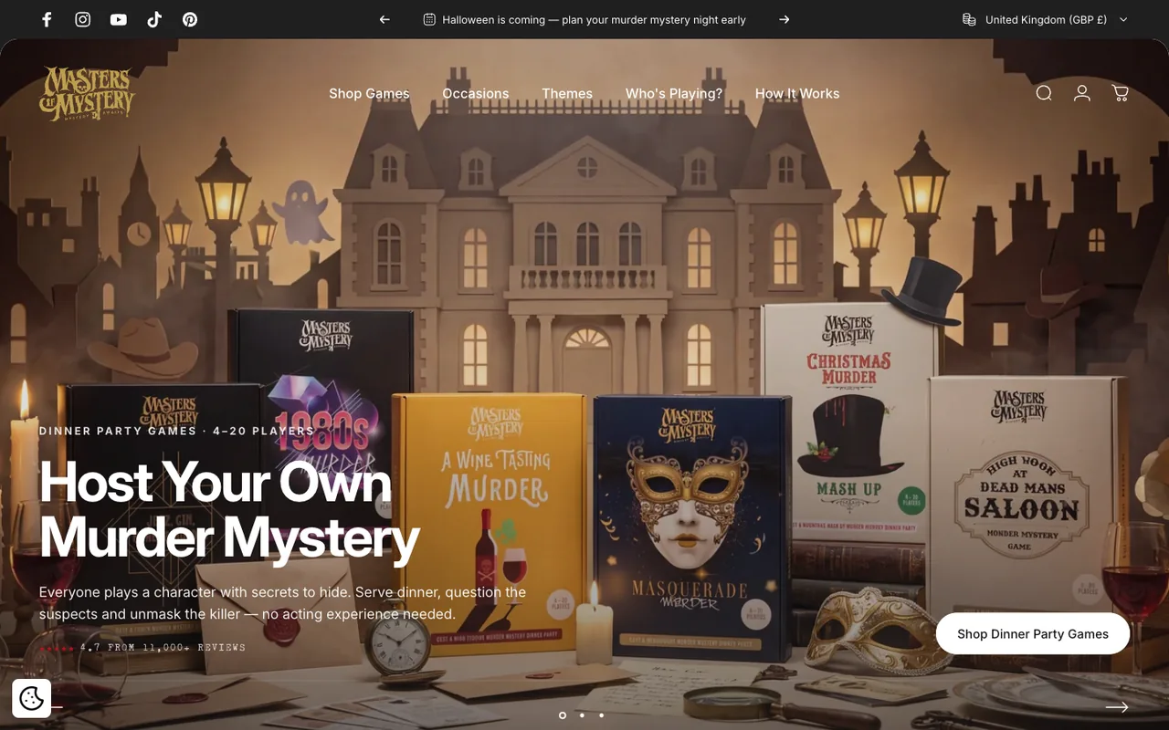
If a game can’t feel like treasure in your hands, it has to feel like treasure on the screen. So we built the shelf first — out of cardboard.
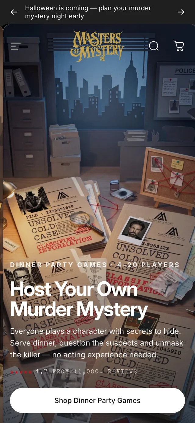
The approach
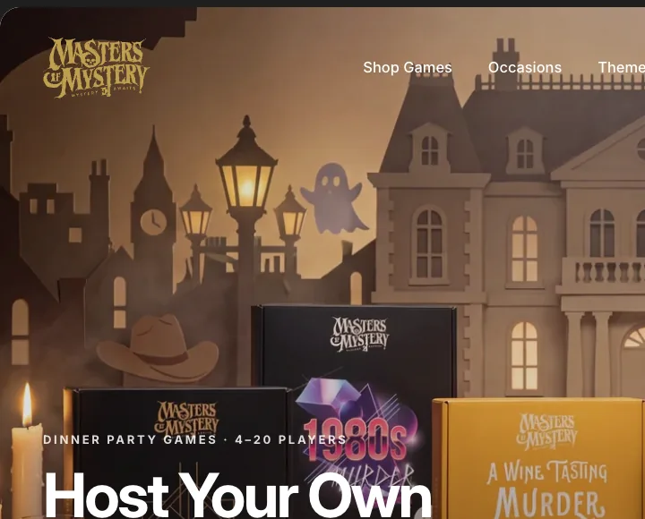
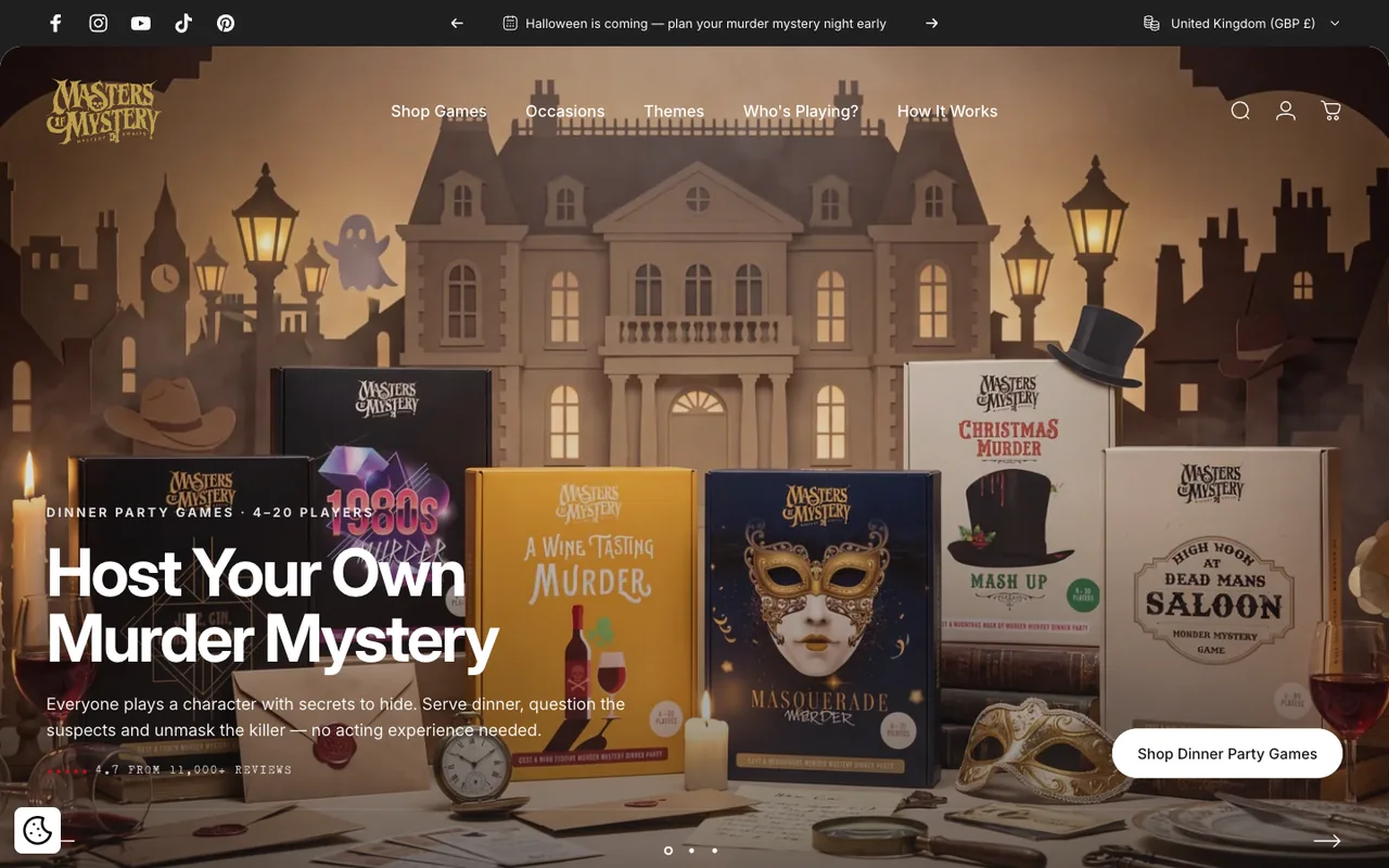
A new gold-struck wordmark that carries the theatre of the games — struck once, then applied everywhere: every box, every screen, every character card. One mark, one world, instantly recognisable on a shelf or a thumbnail.
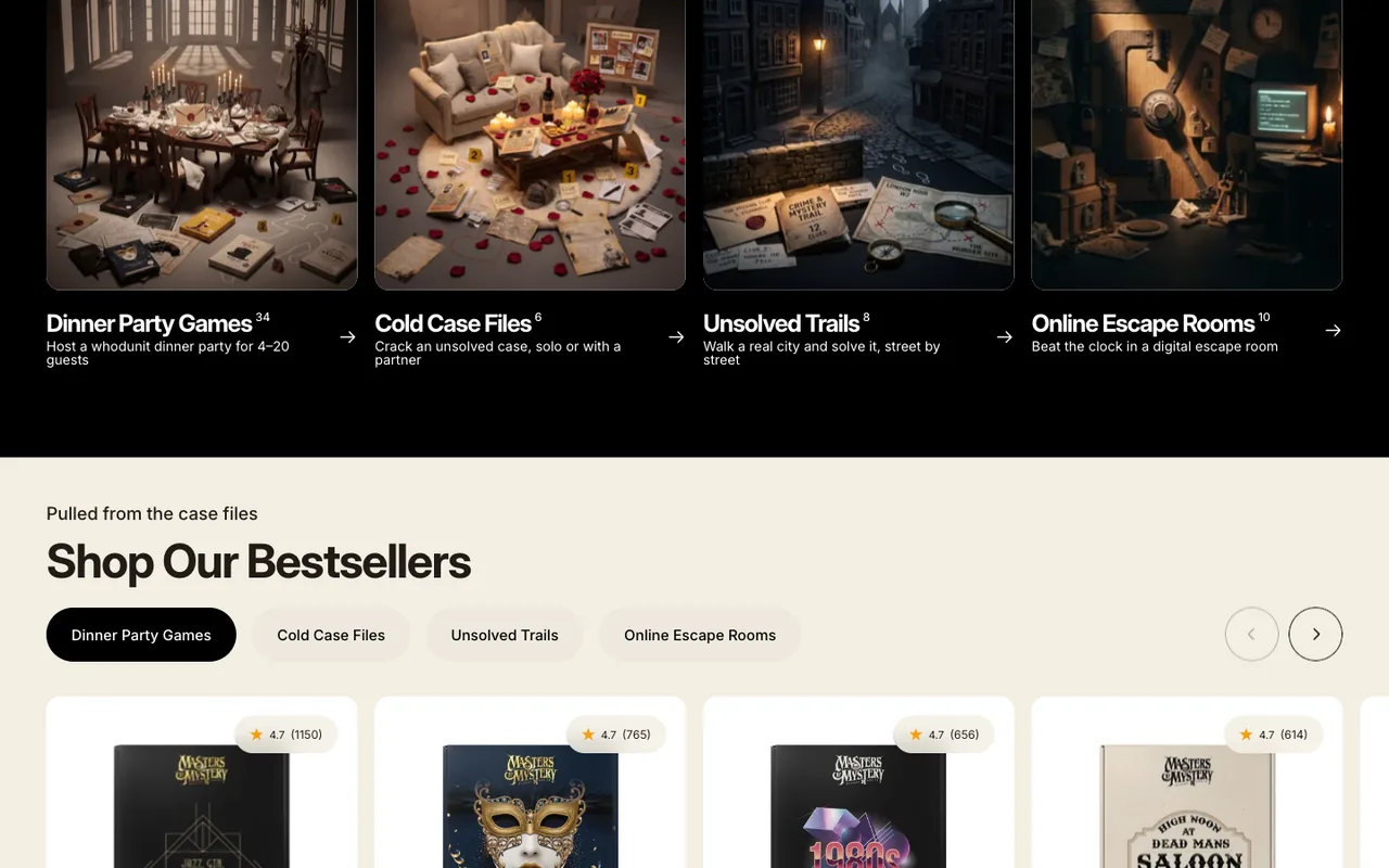
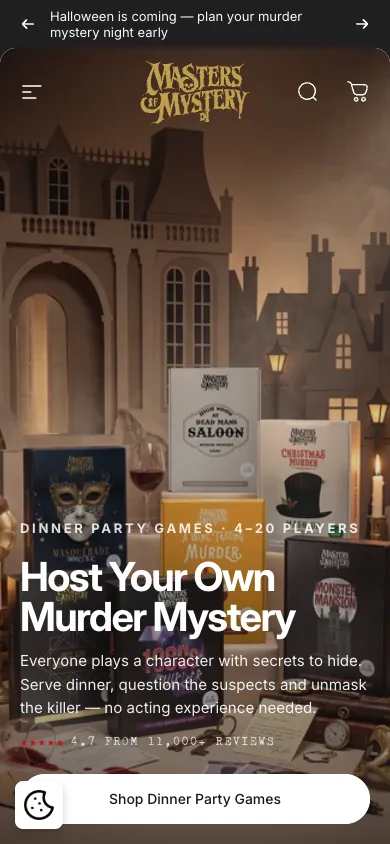
Gold-foil identityThe art direction that makes the brand: every flagship staged as a hand-built paper diorama — mansions, saloons and city streets cut from card, lit like film sets. Sixty-three games re-staged in the new language, each cast given faces.
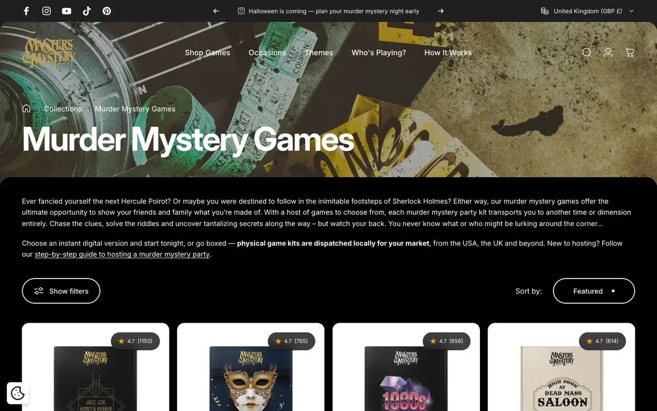
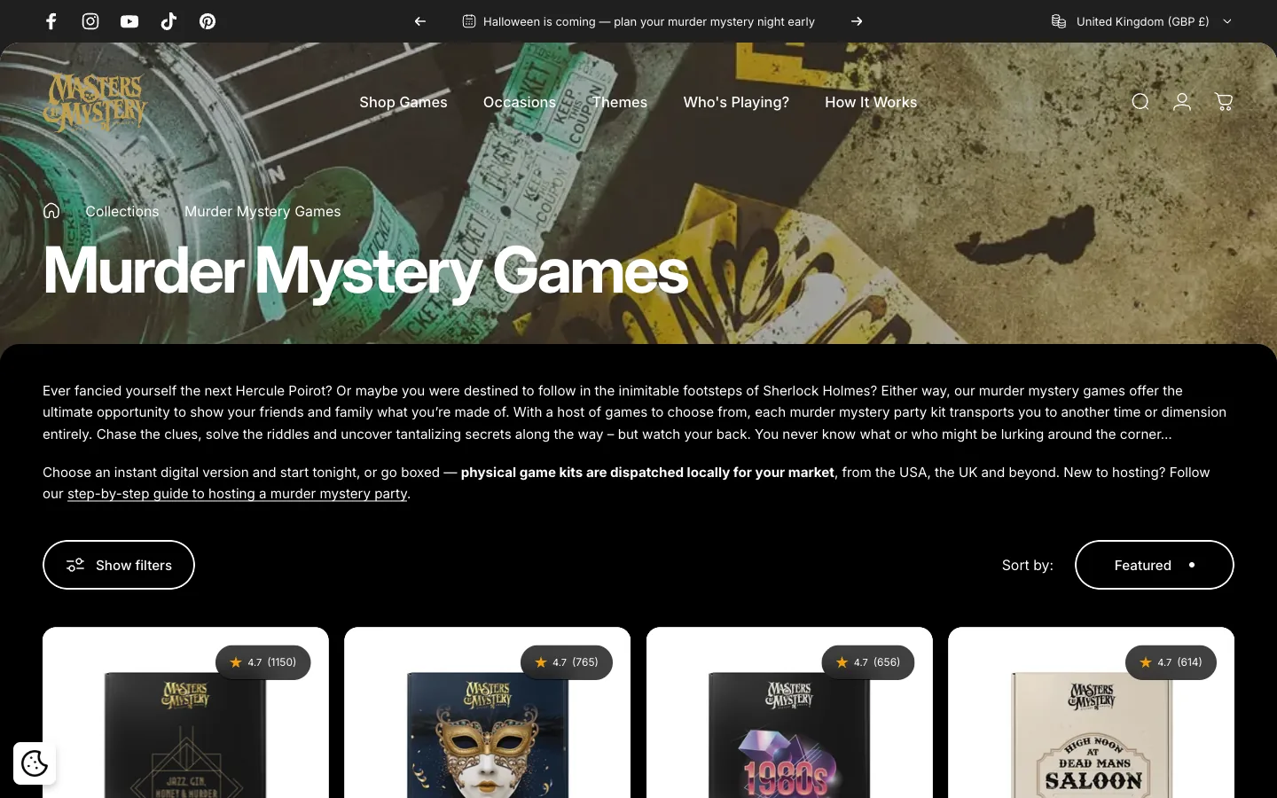
63 games re-stagedA ground-up Shopify build to carry the new world: bespoke theme, a navigation rebuilt around how people actually shop — occasions, themes and who’s playing — player-count filters, and a bundle system that rewards bigger party nights.
New theme · new IAThe launch cut homepage media weight by 73%. The storefront ships natively in English and German. And the buying journey now hands off cleanly into the companion app and case portal, so the night you bought begins the moment you check out.
−73% media weightThe delivery
One team, one timeline — identity, art direction and engineering delivered as a single programme, not three briefs.
The craft